Supporting remembrance through thoughtful apparel design
Challenge
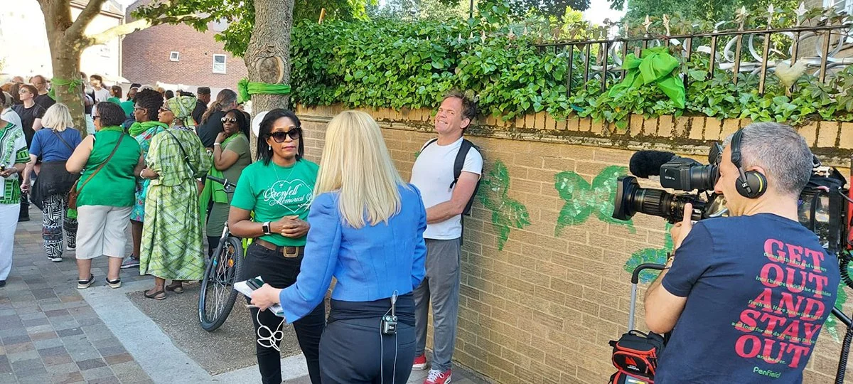
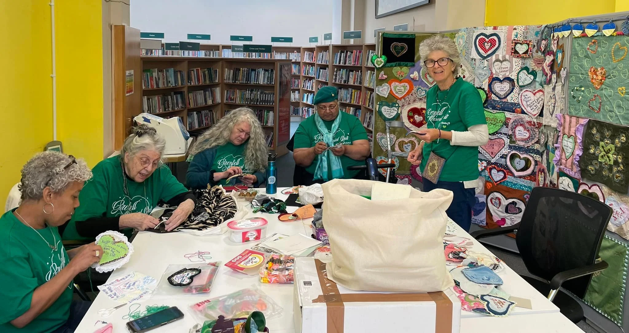
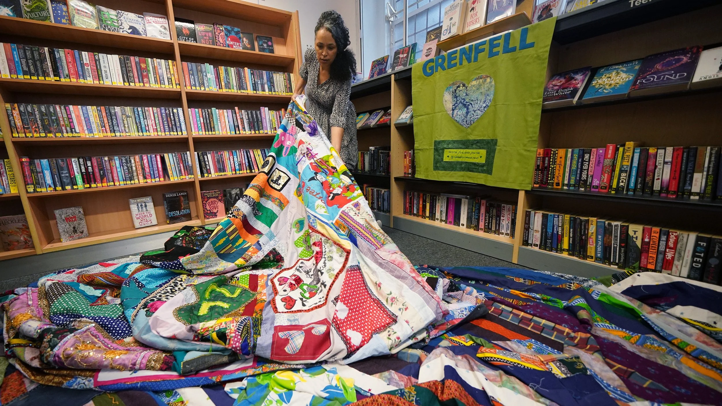
The Grenfell Memorial Quilt honours the 72 lives lost in the Grenfell Tower fire through individually crafted panels made by families, friends, and members of the wider community. Each square represents a life, a story, and a collective act of remembrance.
The challenge was to design T shirts that could support the non profit initiative while remaining respectful of its purpose. The apparel needed to align with the established visual language of the Grenfell movement, particularly the green heart symbol, without diluting its meaning or turning it into a trend driven graphic.
The work had to feel sensitive, unified, and rooted in solidarity rather than self expression.
Strategy
The strategy centred on amplification rather than reinvention.
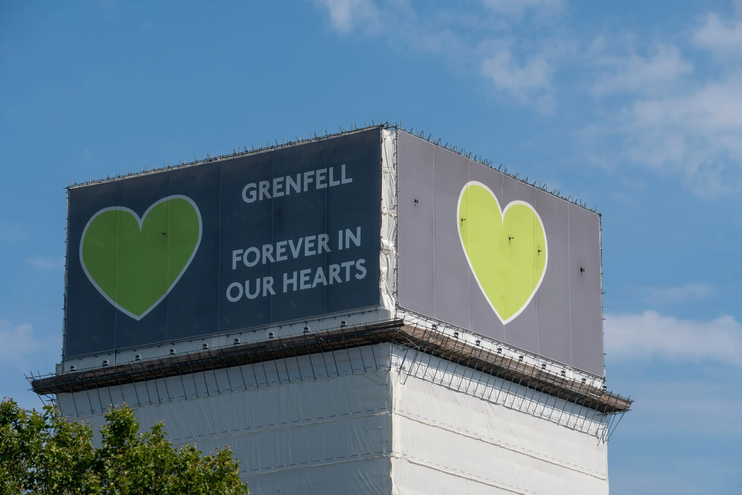
The green heart was already a powerful and widely recognised symbol associated with the Grenfell community. Instead of creating something new, the direction focused on strengthening and framing this existing icon in a way that translated clearly to wearable form.
The T shirts were treated as a canvas for remembrance. The design avoided unnecessary decoration and instead prioritised clarity, legibility, and emotional weight. Restraint became the guiding principle.
By keeping the message focused and the aesthetic clean, the apparel could act as a visible sign of support while remaining dignified.

Approach
The art direction began with studying the visual history of the Grenfell movement, including banners, murals, and community materials. The green heart served as the central anchor.
Typography was selected to feel strong but neutral, ensuring it did not compete with the symbol. Layouts were balanced and centred, allowing the heart to hold presence on the garment without overcrowding the composition.
Colour choices respected the established green tone, paired with understated garment bases to maintain contrast and clarity. Production considerations, including print method and fabric choice, were approached carefully to ensure the final pieces felt high quality and appropriate for commemorative wear.
Every design decision was filtered through one question, does this honour the purpose of the Quilt.

Outcome
The final T shirts provided a simple, unified way for supporters to stand with the Grenfell Memorial Quilt initiative.
By drawing directly from the existing green heart symbolism, the designs felt connected to the wider movement and immediately recognisable. The restraint in the art direction allowed the message of remembrance to remain central.
As a portfolio piece, the project demonstrates sensitivity in design, the ability to work within established visual language, and an understanding of when to lead creatively and when to step back in service of a greater cause.