Turning an inside joke into a running identity for the Wicklow Way
Challenge
What started as a throwaway joke quickly became something bigger.
A fictional character named Lazy Lemon emerged from a conversation about children’s book titles. Within minutes, the name had developed lore, controversy, and personality. It became shorthand within our group for procrastination, humour, and shared history.
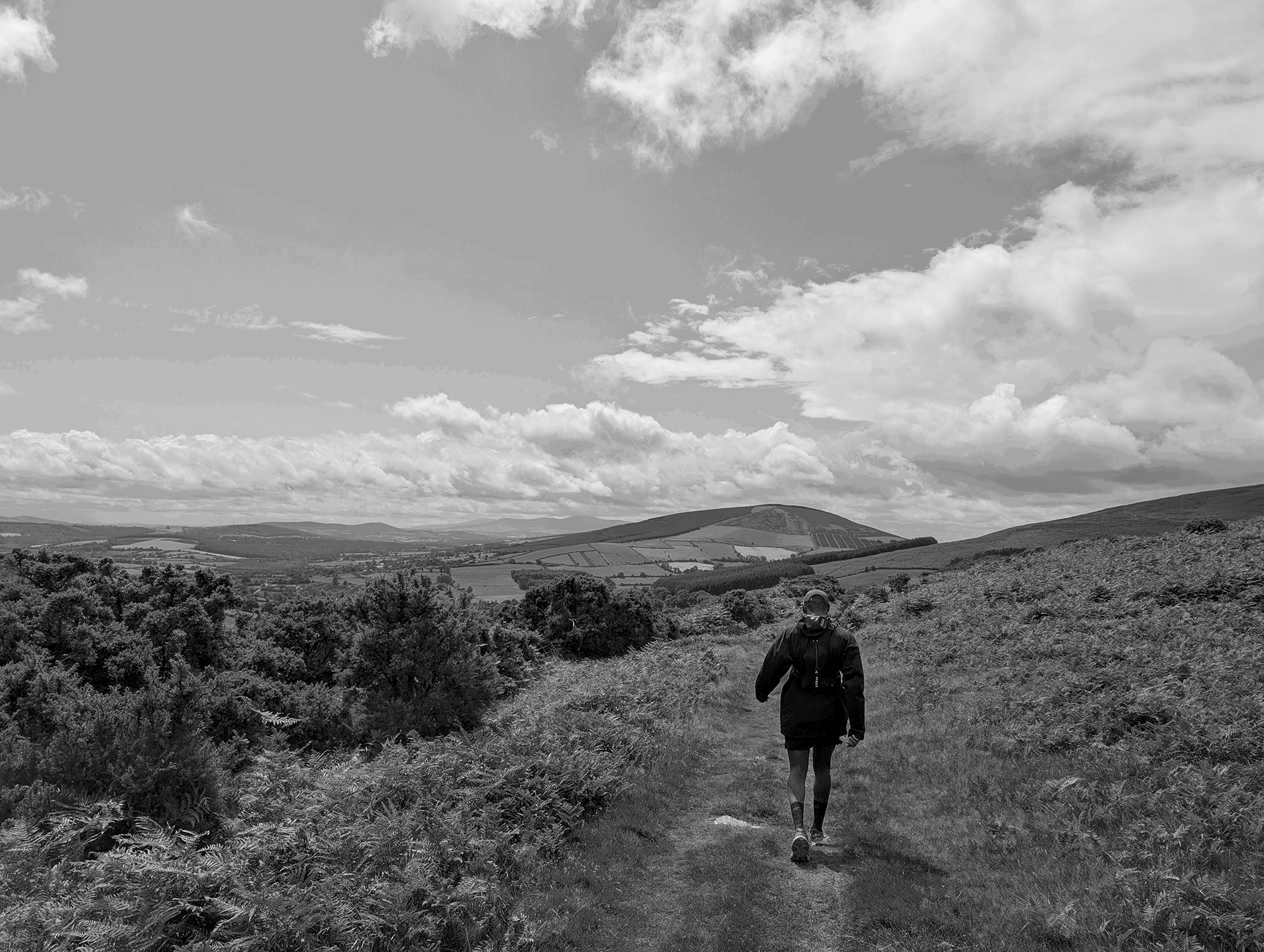
When we committed to running the Wicklow Way in Ireland, we saw an opportunity. The challenge was to transform a private joke into a cohesive identity that could motivate a group through training while still retaining the humour that made it meaningful.
The brand needed to feel self aware and playful, but also credible enough to sit on running gear, social posts, and training updates without feeling forced.
Strategy
The strategy was to treat Lazy Lemon as if it were a real club with a backstory.
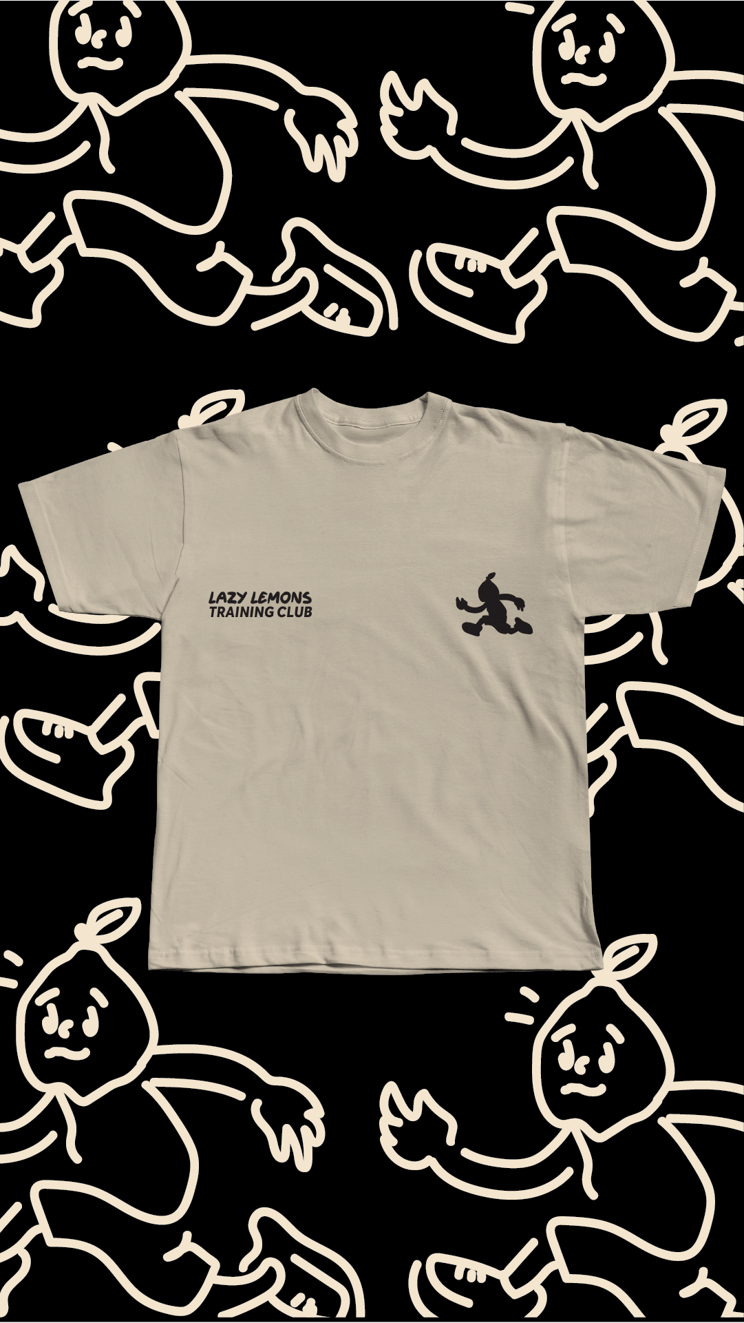
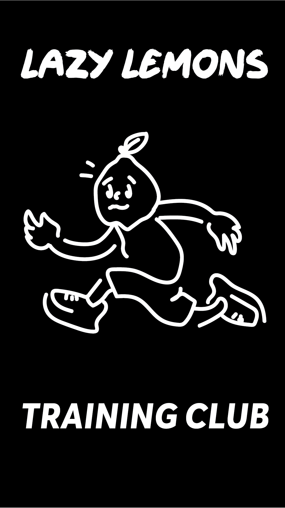
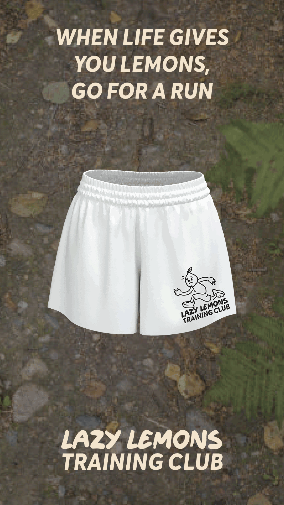
Rather than designing a one off logo, the idea evolved into the Lazy Lemon Training Club, a tongue in cheek running collective built around contrast. The name suggested laziness, but the activity demanded discipline. That tension became the core of the identity.
The tone was deliberately bold and slightly irreverent, inspired by contemporary running brands and streetwear collectives. This helped elevate the concept beyond a simple joke and into something that felt intentional.
The brand had to balance irony with pride. It needed to say, we know this started as a joke, but we are still taking the challenge seriously.

Approach
The process began with defining the character of Lazy Lemon. Was it a villain, a mascot, or a symbol of resistance to effort. We leaned into ambiguity, allowing the name to carry humour while the visuals carried strength.
Visually, the identity focused on clean typography and confident layouts. High contrast colour combinations referenced citrus tones, sharp yellows against deep black or muted neutrals. This made the name instantly recognisable and adaptable across formats.
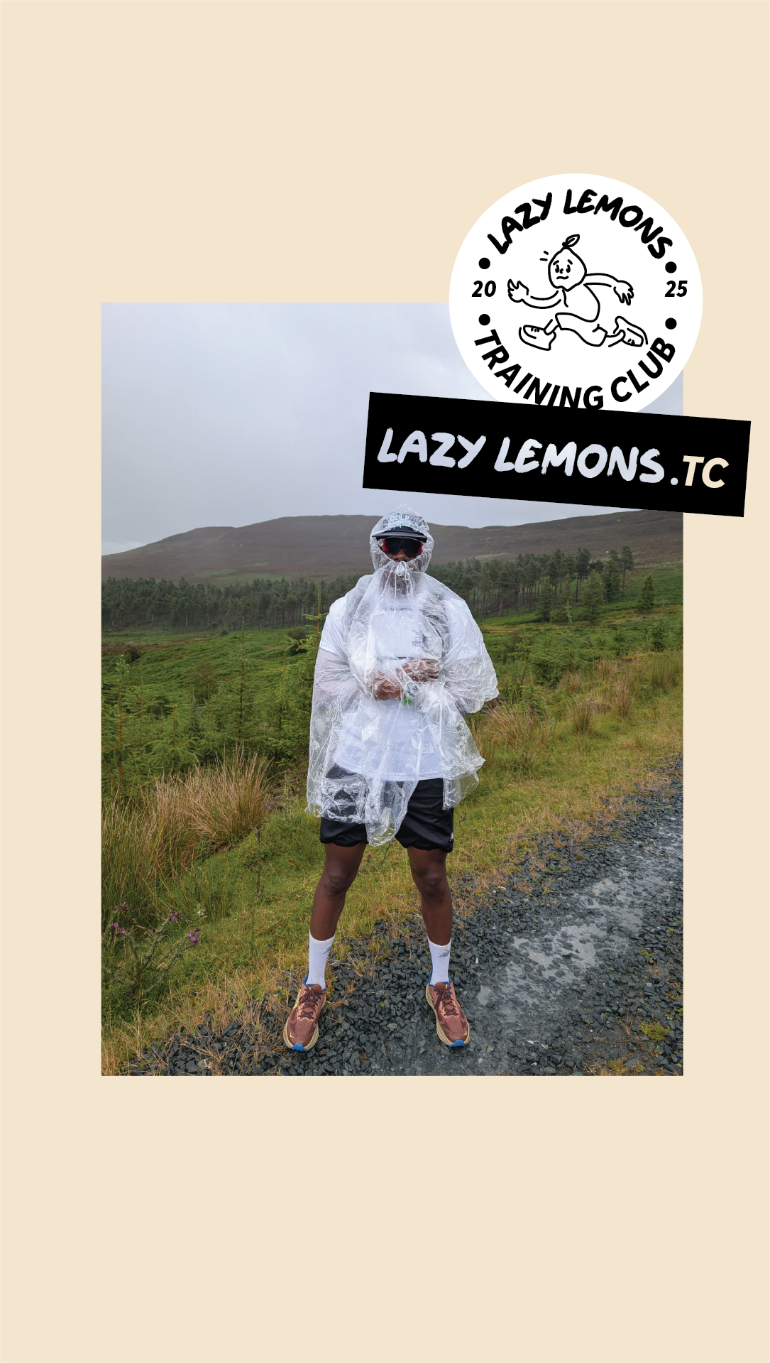
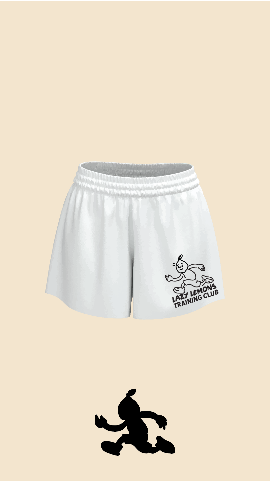
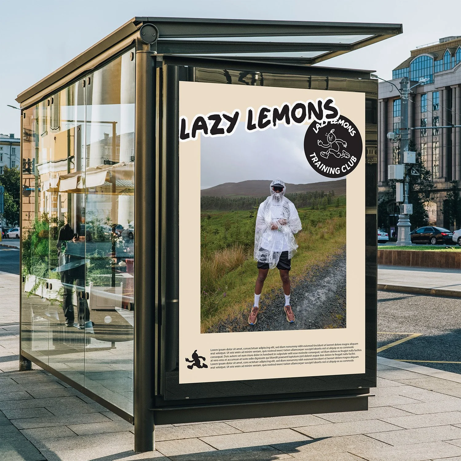
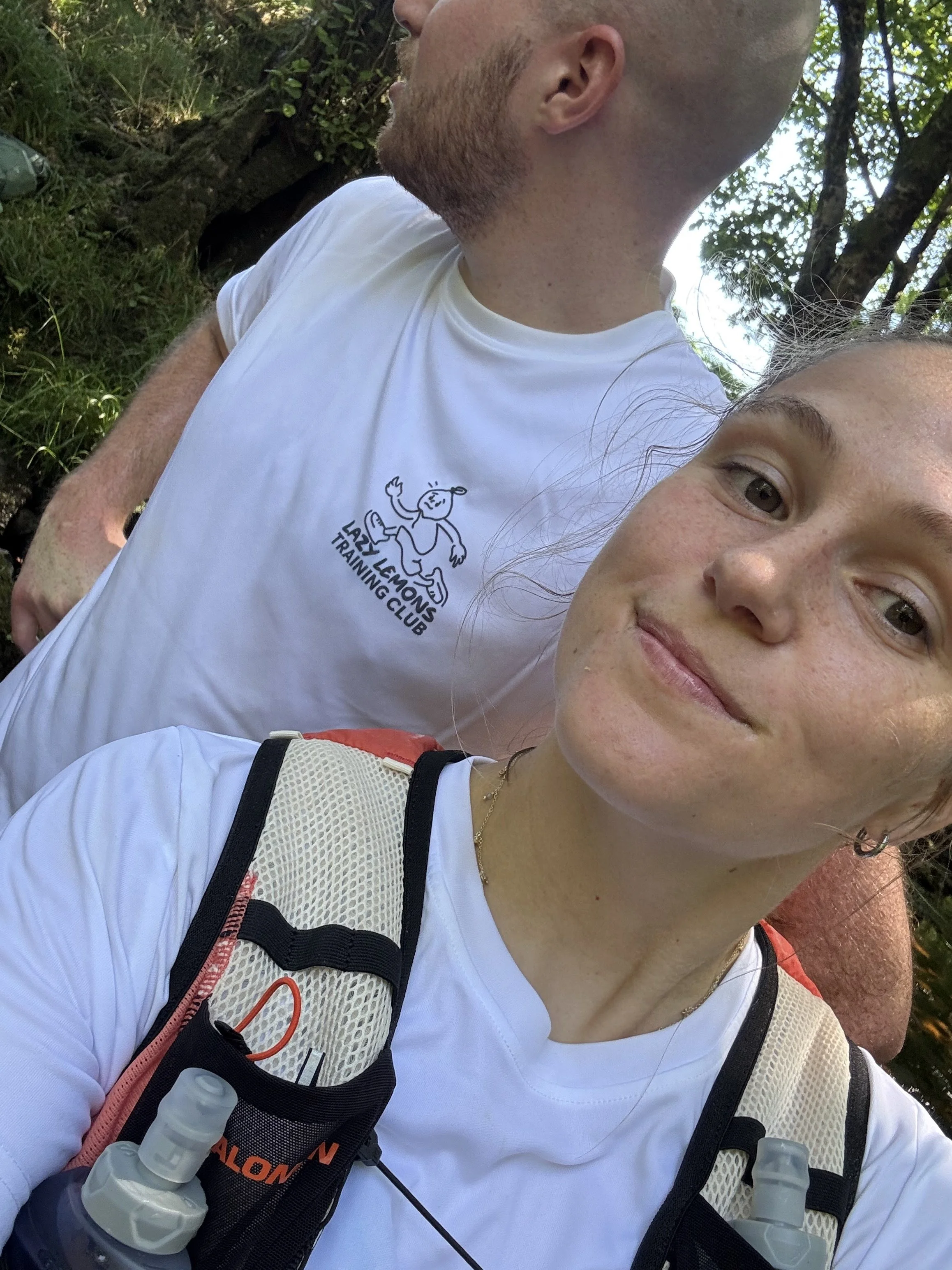
The club identity was then applied to training graphics, social content, and potential merchandise such as tees and caps. Messaging played with the contradiction at the heart of the concept, using lines that embraced laziness while celebrating endurance.
By building a small but consistent visual system, the idea felt cohesive rather than improvised.
Outcome
Lazy Lemon Training Club became more than a joke. It became a shared banner under which we trained and prepared for the Wicklow Way.
The identity added energy to early morning runs and long training sessions. It gave the challenge a narrative and turned a physical goal into a collective story.
As a portfolio piece, the project demonstrates the ability to spot creative potential in everyday moments, build a brand world from a single phrase, and translate humour into a cohesive visual identity. It shows how culture, even at a small scale, can become the foundation for meaningful design.