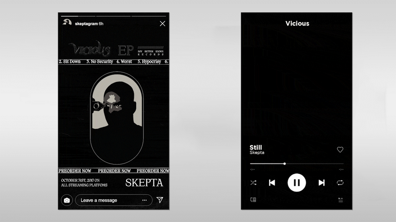
A conceptual art direction project blending modern Halloween iconography with gothic horror influences
Challenge
The brief was self initiated but grounded in a real cultural moment. The challenge was to create a cohesive visual campaign for a fictional Halloween EP by Skepta that felt authentic to his brand while pushing into darker, more cinematic territory.
Halloween visuals can easily become predictable, pumpkins, costumes, novelty horror. The goal was to avoid cliché and instead build a campaign rooted in atmosphere. It needed to feel premium, contemporary, and aligned with Skepta’s sharp, minimalist identity.
The project also had to balance multiple influences, modern Halloween aesthetics, gothic literature, classic horror cinema, and psychological thriller motifs, without becoming visually chaotic or over styled.

Strategy
The strategy centred on restraint and mood.
Rather than leaning into loud horror tropes, the concept drew from the tension and symbolism found in gothic literature and classic psychological thrillers. References included stark lighting, shadow heavy compositions, distressed textures, and minimal but symbolic props.
The campaign was positioned as immersive rather than decorative. Every visual element needed to contribute to a sense of unease and sophistication. Typography was kept strong and direct, allowing the atmosphere to carry the narrative rather than relying on elaborate graphic devices.
This ensured the work felt aligned with Skepta’s established visual language while expanding it into a darker seasonal space.
Approach
The art direction began with a visual research phase, mapping connections between contemporary street culture and gothic references. Moodboards pulled from horror cinema stills, abandoned architecture, chiaroscuro lighting, and thriller poster compositions.
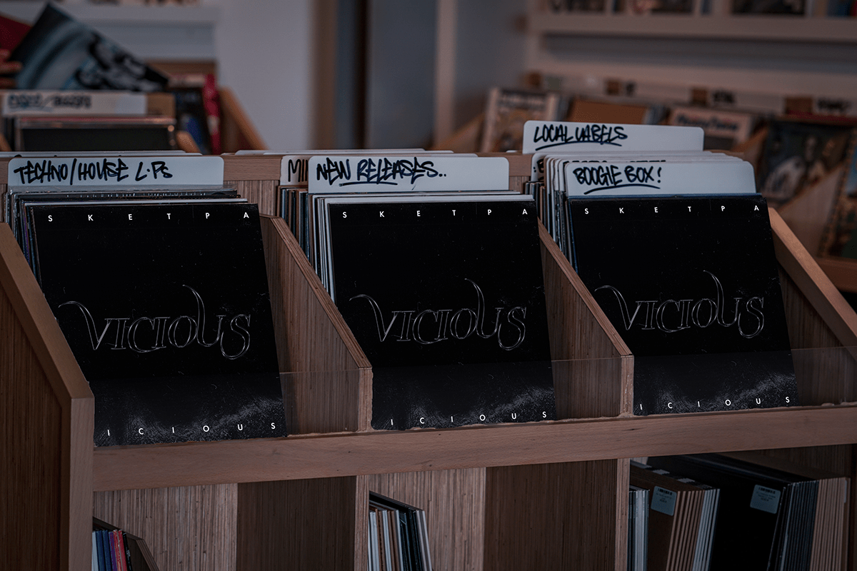
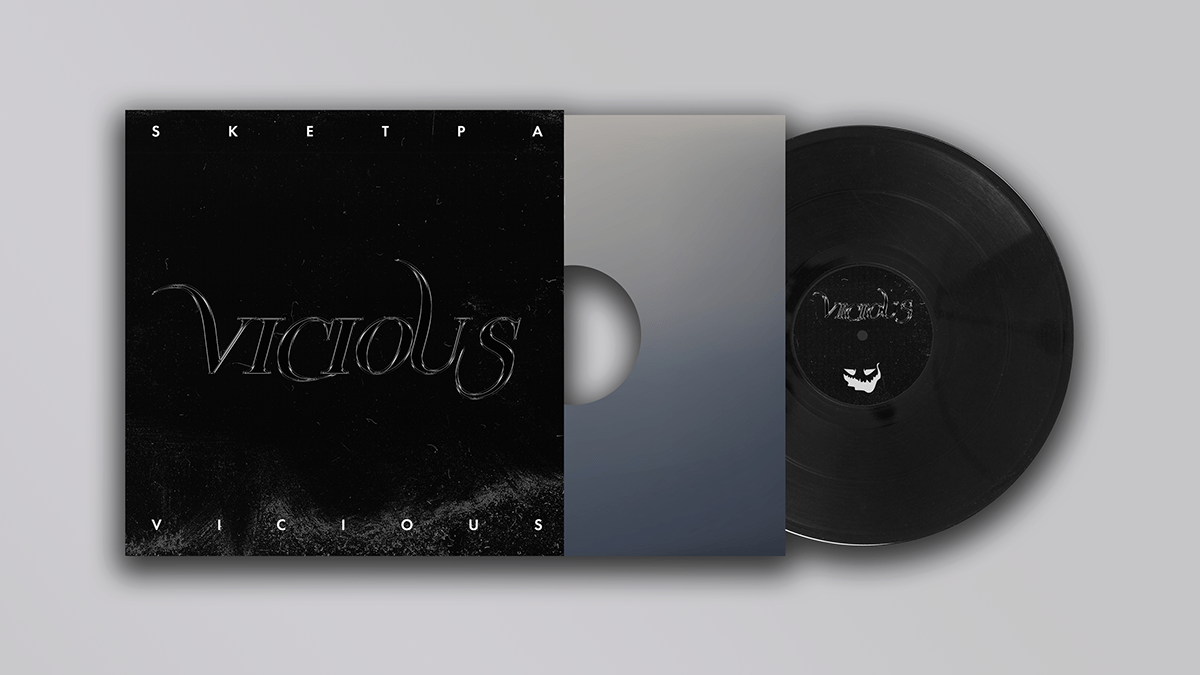
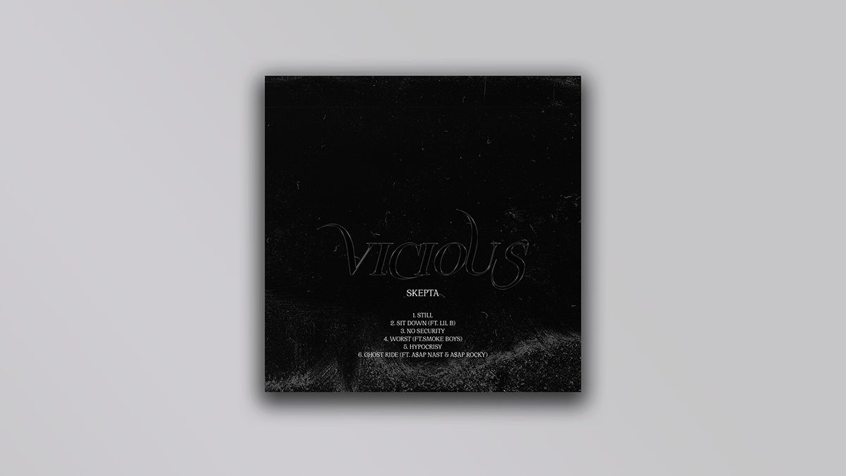
Colour was tightly controlled. Deep blacks, desaturated greys, and muted crimson tones formed the core palette. Contrast was used intentionally to create tension, especially in portrait compositions.
Imagery was treated with subtle grain, shadow gradients, and sharp directional lighting to evoke a cinematic quality. Negative space was embraced to heighten drama and focus attention on the subject.
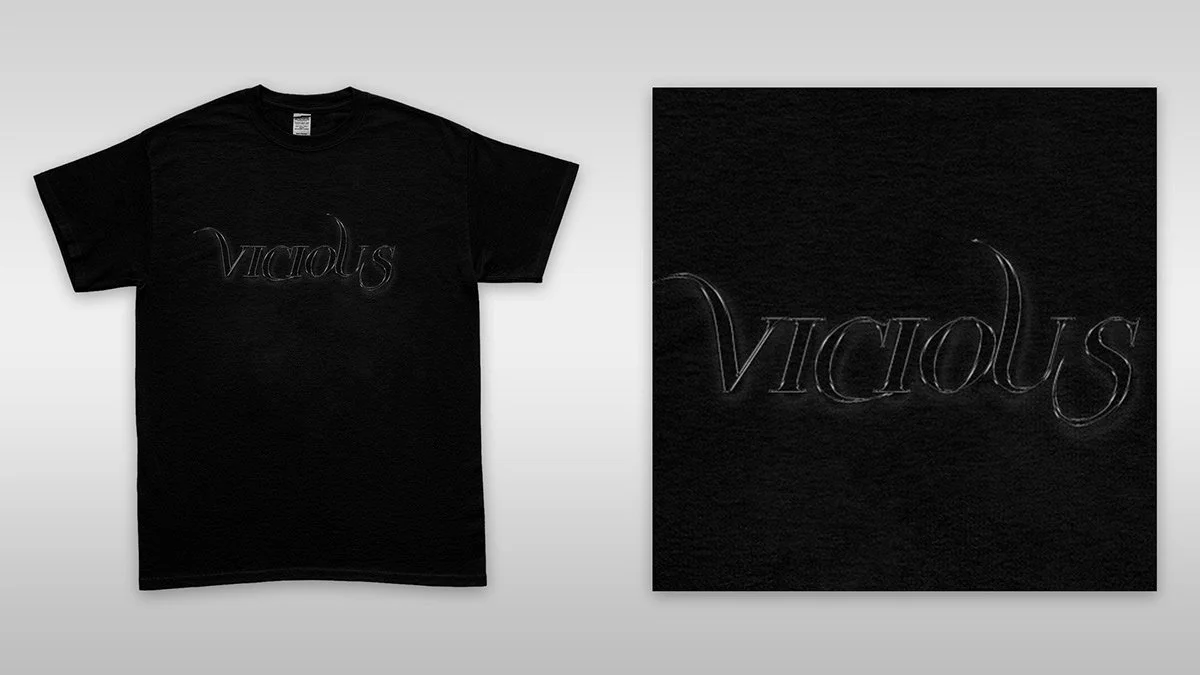
Typography was minimal and assertive, allowing the title Vicious Halloween to feel deliberate and commanding. Layout systems were designed to work across digital rollout assets such as cover art, social teasers, posters, and potential merchandise applications.
Outcome
The final concept presented a cohesive campaign world that felt immersive and distinctive. By combining gothic references with contemporary minimalism, the project avoided seasonal cliché and instead created a darker, more elevated interpretation of Halloween within music culture.
As a self initiated project, it demonstrates conceptual thinking, cultural awareness, and the ability to build a campaign identity from research through to execution. It also showcases versatility beyond corporate communications, expanding into music and fashion aligned creative direction.